For the original article in English, CLICK HERE
この記事では、Webサイトやデジタルマーケティングに対しての日本人と西洋人の違いに焦点をあてます。想定読者は、日本以外の国々へ向けて、グローバルなWebサイトを作りたいと願っている日本企業の方々です。
私は、日本で12年間以上暮らしていているアメリカ人として、日本人ユーザーとアメリカ人ユーザーを比較します。比較対象はアメリカ人なのですが、多くの場合、他の西洋人、つまりヨーロッパ人やオーストラリア人、ニュージーランド人に対してもその考察は当てはまるでしょう。
この記事では特に、西洋人に刺さるランディングページを作るにはどうしたらヨイのかを説明します。同時に、避けるべき、よくある失敗もあげます。日本企業がインターナショナルWebサイトを作る際に犯す過ちには一定の傾向があるのです。最後に、西洋人に刺さるWebページの例をお見せします。
Webサイトユーザー:日本人の場合 vs アメリカ人の場合
日本人がWebサイトを訪れると、その人は時間をたっぷり使って、文章を読み、提供されているオファーを吟味し、そのWebサイトが信用するにあたいするか考えます。もし、ホームページ上に一定以上の長さの文章や、多くの小さな画像が掲載されていない場合、日本人ユーザーは、そのWebサイトを信用しません。
対象的に、アメリカ人はとても短気な人たちです。あるWebサイトを訪れたとき、5秒あるいはそれ以下で、強い印象を残さない限り、そのユーザは戻るボタンをクリックして、Webサイトを離脱してしまいます。
あなたのWebサイトを診断する2つの方法
以下、2つのテストに合格しないと、アメリカ人を相手に効果をあげるのは難しいでしょう。
5秒テスト
Webページにランディングした5秒後にアメリカ人は決断をくだします。そのページを読み進めて提供されているものを吟味するのか、あるいは、戻るボタンをクリックして他のページへ行くのか。
その5秒間でアメリカ人は次のことをします。1)タイトルを読む。2)メイン画像をチラ見する。3)CTAボタンに書かれた文字を読む。4)そしてなかには補助的な文章を読む人もいます。
英語で言われることに「第一印象をつくるチャンスは一度しかない」というものがあります。アメリカ人相手のビジネスで成功したければ、この5秒テストをパスしなくてはいけません。ユーザーに、Webサイトに滞在、回遊してもらうには、第一印象で心をがっちり掴むことが必要なのです。
日本以外から訪問するユーザーに対して、この5秒テストにパスすることが非常に重要です。しかし、それに気づいている日本企業はまだまだ少ないのが実情です。
日本企業は、日本人ユーザーに対する期待値をそのまま、非日本人ユーザーにも当てはめてしまいます。日本企業は自らのサービスの正当性を訴えようとして、多くの画像や文章で、ユーザーを爆撃してしまうのです。結果的に、複雑なページが出来上がり、ユーザーはそれを嫌気して離脱してしまっているのです。
「私にいいことあるかしら?」テスト
もう一つの重要なテストは「私にいいことあるかしら?」テストです。ランディング後の数秒間で、ユーザーに対して、この製品やサービスは誰のためのもので、どんなベネフィットがあるのかを知らせなくてはいけません。
日本企業のWebサイトはテストに合格するか?
多くの日本企業の海外向けWebサイトは、これらのテストに落第します。H1タイトルタグを使っていないWebサイトを見たことさえあります。訪問者を惑わせるだけでなく、Googleがサイトを発見してカテゴライズすることも難しくしてしまいます。サイトにタイトルがある場合も、ページで最も目立つ一等地を会社名で埋めてしまったりしています。また、多くの日本企業のWebサイトのタイトルは、スローガンを述べるだけで、ユーザーに対するベネフィットを明示していません。
意味のない英語スローガンの例
- ・(弁護士事務所)法務サービスを提供して一世紀、我々の精神は年々若返る
- ・(ベルト製造業)未来へのブレイクスルー
- ・(化学原料製造業)日常生活の必需品を提供して80年
上記の例はどれも、私がはじめてその会社のWebサイトを訪れた時、何の意味も持ちませんでした。
日本企業の海外向けWebサイトによく見られる、非日本人にとって意味のないものリスト
- ・What’s Newセクション
- ・CEOの挨拶
- ・ニュースリリース
- ・財政状況
- ・開催予定のイベント
- ・オフィスや工場の写真
ですから、以下にあげることを試してみてください。
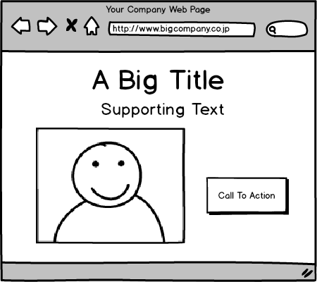
- 1)刺さるタイトル。製品やサービスがユーザーにもたらすベネフィットを強調するもの
- 2)明快なCall-to-Actionボタン。ユーザーが次にすべきことは、この上なく明確に
- 3)美しいメイン画像。ユーザーが製品やサービスを使った時にどんな気持ちになるのかを表すもの
- 4)サポート文章。ユーザーにもっとこの会社のことを知りたいと思わせるもの
- 5)必要な場合は、もう一つCall-to-Actionボタン。ユーザーが必要な情報を得るために押したくなるもの
素晴らしい例
西洋人に対して効果的なランディングページの例として、Uberのホームページをあげます。
Uberとは配車サービスの会社で、タクシー会社と競合しつつも、天文学的なスピードで成長しています。彼らのホームページを見てみましょう
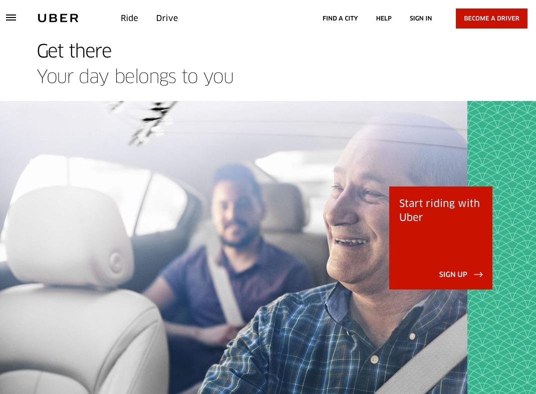
上にあげた5つクライテリアに当てはめて見てみます。
1)刺さるタイトル
2)明快なCall-to-Actionボタン
3)美しい背景画像
メイン画像を何にするかは、Webサイトをデザインする際に最も重要なことです。
この画像を見た時に私の頭に浮かぶのはこんなことです。
・活発に、そしてフレンドリーに会話している知的な二人の男が見える。彼らは楽しんでいるようだ。もし私がUberを使ったら、知的な運転手から学びを得るなど、移動以外のベネフィットを得るかもしれない。
・運転手は、引退した大学教授のようだ。彼なら間違いなく私を目的地へ連れて行ってくれそうだ。
・車もとても素敵だ。匂ってきそうな革の座席。ベンツのようだ。
このようなUberに対する素敵な感覚は、この画像が引き起こしたものです。Uberは何度もABテストを繰り返し、この画像に辿りついたのだと思います。
全体的に見て、この画像は私に刺さりました。自分自身がこの画像の中にいるかのようにイメージ出来たからです。この画像があるから「私にいいことあるかしら」テストに答えることが出来るのです。
4)補助的文章
5)もう一つCall-to-Actionボタン
おぼえておいてください。これらは全て、5秒テストと「私にいいことあるかしら」テストを通過するために必要なのです。Uberのケースでは各要素は非常に上手く機能しています。Uberは、登録CVRに満足していることでしょう。
他の効果的なランディングページの例は、以下の記事を参考にしてください。
http://www.jcdigital.jp/blog/elements-high-quality-landing-page/ (English)
http://www.jcdigital.jp/ja/blog/elements-high-quality-landing-page/ (Japanese)
結論
おぼえておいてください。日本人と西洋人のユーザーがWebサイトに期待することには著しい違いがあります。多くの日本企業はこれら西洋人の違いを考慮に入れていません。そして、西洋人には刺さらない、ランディングページや、ホームページを作っているのです。
もし、あなたが日本企業で西洋向けのランディングページを作る場合は、日本のWebサイトで流行っているものから距離をおいてください。初回訪問者にとって意味がなく曖昧なスローガンを載せるのは止めましょう。CEOの挨拶やニュースも初回訪問者にとっては価値がありません。それらはゴールを達成する際の邪魔になるだけです。
西洋人向けのランディングページを作る際は、5秒テストと「私にいいことあるかしら」テストで高得点をマークするのことが重要です。ユーザーに対して、このサイトは誰に対して作られているのか、そしてどんな価値をもたらすのかを5秒で伝えなくてはいけません。
最後に、ランディングページはシンプルにしましょう。多くの選択肢や、相反する情報でユーザーの心を乱してはいけません。
刺さるランディングページの5つの要素を覚えておいてください。
- 1)刺さるタイトル
- 2)明確なCall-to-Actionボタン
- 3)美しく、ベネフィットを表現するメイン画像
- 4)補助的文章
- 5)(必要なら)追加のCTAボタン
ランディングページを作成する際、これらのシンプルな原則を適用するだけで、
これまでよりも多くの海外顧客を魅了し、売上と利益を上げることが出来るはずです。
the original article
This article is part of a series to highlight the differences between Japanese and Western approaches to Websites and Digital Marketing. It is aimed at Japanese companies who want to create global websites that appeal to the rest of the world.As an American who has lived in Japan for more than 12 years, I often compare Japanese users with American users. While I often compare Japanese to Americans, the same could apply to all Westerners, be they Americans, Europeans, Australians or Kiwis.
Specifically this article, I want to explain in detail what it takes to make a great landing page that will appeal to a Western audience. I will also point out some common mistakes to avoid. These are mistakes that Japanese companies make over and over again on their international web sites. Finally, I will present an example of an effective page in use today that appeals to a Western Audience.
Japanese Website Visitors vs. Americans
When a Japanese user visits a site. They tend to spend some significant time viewing the site, reading the text, and analyzing the offers to see if your site has credibility. If your home page is lacking large amounts of supporting text, and many small images, Japanese users feel that you are hiding something.By comparison, we Americans are very impatient human beings. You have 5 seconds or less to impress us, otherwise, we hit that back button and leave your site.
Two Tests to Evaluate Your Site
Here are 2 tests that your Landing Page needs to pass to be effective to Americans.
The 5 Second Test
At that 5 second point after visiting a page, American readers make “THE decision”. They will decide to continue reading your page and consider your offer. Or, they will decide to hit the Back Button and move on to something else.In that 5 seconds, we will read the Title, glance at the Main Image, read the Call-to-Action button, and maybe scan some supporting text.
As they say in English, “you only get 1 chance to make a first impression”. So, if you want to succeed with Americans, you need to pass the “5-Second Test”. You need to provide a highly engaging first impression to make them want to stay on your site and continue.
For international visitors, it’s really important to pass the 5-Second Test. Yet very few Japanese companies can pass this test themselves. Implicitly, they apply the same expectations of international users as Japanese users. They bombard the user with lots of images and text, trying to provide proof that they have a valid service to offer. The result is the extra complexity scares the user away.
“What’s In It For Me?” Test
Another test that is really important is the “What’s In It For Me” Test? During the first few seconds on the page, the reader needs to know WHO this product or site is for, and what BENEFIT they will get from you or your offer.
How Well Do Japanese Sites Score?
Most International Japanese Websites fail this test as well. Many don’t even have H1 Title Tags. This makes it not only hard for the reader to focus, but also makes it difficult for search engines like Google to even find and categorize your page. And, of those sites that have a title, many waste prime real estate by only stating their company name. Many more Japanese company website titles display value slogans that give no real indication of the benefit they provide for the reader.
Examples of Pointless Slogans in English:
- (Law firm) We have provided legal assistance for one entire century, and our spirit gets younger with every year.
- (Belts Manufacturer) Breakthroughs for the future.
- (Chemical & materials company) 80 Years of supplying Essentials to Daily Life
In each of these cases, the statements have no meaning to me as the first time visitor.
Here is a list of things that many International Japanese Websites have that are pointless to global visitors.
- “What’s New” Section
- Introduction from the CEO
- News Release
- Financial Results
- Upcoming Events
- Pictures of the office or manufacturing plants
Please don’t misunderstand, all these things above are important. But they don’t need to be on the top 1/3 of your home page (AKA “above the fold”). That viewable “screen real estate” on your home page or landing page, is immensely valuable.
Instead, try focusing on these things.
- A Great Title that highlights the benefit the user will get if they use your product or service.
- A clear Call-to-Action Button. The next step should be completely clear.
- Beautiful Main Image that reinforces the benefits of how a user will feel if they use your product or service.
- Supporting text that encourages users to continue reading down the page to learn more about your company.
- If necessary, additional CTA’s that encourage users to self select to get to the right information they need.
A Great Example
As an example of the really effective landing page for Western Markets, I would like to present the home page for Uber.
Uber is a ride sharing company that is competing with taxi services, and growing astronomically. Let’s take a look at their Home Page.
Let’s view this page with the 5 criteria mentioned above.
1. A Great Title
2. A Clear Call-to-Action
3. A Beautiful Background Image
The main image can be the most important choice you make when you design the website. 。
a. Here is what I infer when I look at this image.
- ・I see two rather intelligent men engaged in an active friendly conversion. Looks like they are having fun. If I use Uber, maybe I will gain some additional benefit like learning from a knowledgeable person.
- ・The driver looks like a retired professor. I feel like I would trust him driving me to somewhere.
- ・The car itself looks really nice. It has nice leather seats, that I can practically smell. Looks like a Mercedes Benz.
b. All of these nice feelings of Uber are inferred from this image. I suspect that Uber has A/B tested countless times against other images.
c. Overall, this image appeals to me, because I can see myself being in this image. It helps answer the “What’s-in-it-for-me” Test.
4. Supporting Text – In this case, there is not much text above the fold. Uber has rejected it to keep it simple & clean. However, if you scroll down, you will see a lot more text that explains the details of the service they offer.
5. Additional CTA’s – Ideally you want to have one CTA. However, in the case of Uber, they are also looking for drivers. So they have an additional CTA button, also in red, in the upper right corner.
Remember, all these things need to work together to pass the 5-Second Test as well as the What’s-In-It-For-Me. And, for Uber, these elements work magnificently well. They must be pleased with their signup conversion rates.
For more examples of effective landing page design, you visit one of these articles here.
http://www.jcdigital.jp/blog/elements-high-quality-landing-page/ (English)
http://www.jcdigital.jp/ja/blog/elements-high-quality-landing-page/ (Japanese)
Conclusion
Remember, there are some significant cultural differences between expectations between Japanese users and Western users. Many Japanese companies don’t take into account these western differences. And, often create Landing Pages and Home Pages that don’t appeal to the Western audiences.
If you are a Japanese company creating a landing page for Western visitors, stay away from items that are popular on Japanese websites. Don’t use pointless vague slogans that have no meaning for first time visitors. Also, remove items like “Message from the CEO”, “News Items” that have no value for the 1st time visitor. It just distracts them from the goal.
When crafting a landing page for Western users, it’s important to score well in the 5-Second Test, and the “What’s In It For Me” Test. You absolutely need to convince users who the site is for, and the value they get in the first 5 seconds.
Finally, keep your landing pages simple, don’t clutter the user with too many choices and conflicting information.
Keep in mind the 5 elements for a good landing page.
- A Great Title
- A Clear Call-To-Action Button
- A Beautiful Main Image that describes the benefits
- Supporting Text
- (if necessary) Additional CTA’s.
When crafting your landing page, if you apply these simple principles, you can attract more international customers, which leads to more revenue and more profits for your business.