
From Spreadsheets to Data Visualization
データヴィジュアライズのソフトウェアの進歩にもかかわらず、スプレッドシート・レポートがいいという人はまだ多いです。インタラクティブなチャートやグラフでデータを表示すると、「ExcelやExcelのようなレポートで正確な数値を表示してほしい」または「とにかく生データを表示してほしい」という言葉をよく聞きます。この記事では、そのような方に向けて、スプレッドシート・レポートと、インタラクティブ・レポートの使い分け方について紹介します。
Despite advances in data visualization software, there are still people who prefer to see spreadsheet reports. Don’t get me wrong–I love excel and I still continue to use it today for certain tasks–but for data visualization, I’ve moved on to bigger and better things. But there are still those who cling to Excel or Excel-like reports: “I want to see the exact numbers” or “Just show me the raw data” are words I often hear when showing someone their data in the form of interactive charts and graphs.
Why might one prefer a table of numbers over a visual representation? I think the reason may be more about familiarity with seeing a spreadsheet report than it is about selecting the best medium for data presentation. Spreadsheets have been around for decades and have undisputed reputation in presenting and modifying raw data. There’s a strong sense of confidence that comes with seeing the raw, unaltered numbers. Yet more and more businesses are turning away from spreadsheet reports and embracing data visualization.
Here are a few reasons why companies are investing in data visualization and analytics software:
- The explosive growth and availability of data means analyzing data sets that are too large for a spreadsheet. Modern data visualization software can interact directly with databases to create dashboards and perform analysis without having to export to Excel.
- Most employees want to know what’s going in their company but they don’t want to look at a spreadsheet. Unsurprisingly, most people find spreadsheets terribly boring and difficult to understand.
- Spreadsheets are difficult to analyze. It’s hard to spot trends and compare performance across multiple periods.
- They are difficult to share. You’ll need to attach it to your email or share it as any other file. Data visualization platforms can allow you to deploy reports to a server where people can access all reports in the same place whenever they need to see it.
To compare the effectiveness between spreadsheets and data visualizations, let’s consider a few examples.
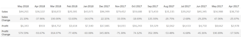
If I want to know how my sales in the month of May 2018 using this crosstab, I can look at the Sales for that particular month and see the value. Indeed, it’s easy to look at just one isolated number–and if that’s all the information I need, then great, a crosstab may be the right way to present the data. But what if I want to understand how sales have been performing from last year up until May 2018? This, after all, puts May’s sales into context. Is that sales number good or bad? Should I be worried or should we be popping the champagne bottles? Is the business on track? With a visualization it’s much easier to see the pattern of performance.
Here’s the same sales data as a visualization.
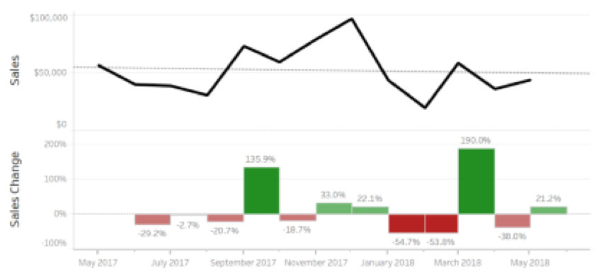
It’s much easier to understand how sales have been performing for the past year. We can immediately see the highest and lowest month sales. The month with the highest sales growth jumps out as well. You may even discover hidden insights within the data that were impossible to see before visualizing the data.
The chart also includes labels on the growth columns, but the labels are only useful once the viewer decides where they should be focusing. Without a visual representation of the data, it is difficult to know what to focus on and what actions we should be taking in our business.
If you’re interested in learning more about data visualization, from history to how-tos, check out Tableau’s list of recommended books: https://www.tableau.com/learn/articles/books-about-data-visualization